Tuesday 26 February 2013

Feature Article Analysis


Like I have done with my other analysis I need to analyse existing products before creating my own once again following what Bentley said (1997) the creative process is “Making of the new by rearranging of the old.” This is essential with the main article as it is the feature article and is the second most important thing next to the front cover because the main article needs to support whatever the front cover is telling the audience. I chose NME once again as I feel as if it represents the indie/rock genre best and this is what I want to follow when creating my final piece.
            The main headline of a magazine article must be something that is relevant to the article, they are usually quotes from the article itself but this varies from magazine to magazine. The main headline of this article is ‘No pain. No gain’ which is what the article itself is about. This is important as the reader and audience must be interested in the article in order to read it. This would appeal to men (target audience) as the abstract noun ‘pain’ is something you would connote with men as it interests them and it’s a masculine word. However the smaller quote in amongst the text itself talks about depression or some form and this may appeal more to the secondary target audience of women as they females are usually more interested in peoples personal backgrounds and things like that. The colours of the font are mostly black for the main body of the text, quote and heading, but there are also blue aspects like the quotation marks and who said it. The blue makes those particular bits of text stand out to the audience but it connects with the colour palette of the image also. 
               The imagery or image on the double page spread article is of the artist that the article is about Biffy Clyro. In terms of iconography this image would appeal more the female audience as he is topless in the image and therefore this would be considered sexy, attractive, seductive. Its an action shot so he is not posing in any way, which would make the reader interested because it’s a shot from a gig of there’s. Men may be interested in this shot because of what he is wearing and he may be seen as a role model to them. I think it is very important to have the feature image the main focus. 
            Overall the style of this double page spread is very interesting as the image is positioned on the left page taking up the whole page and the article is on the right side. I think this is a good style however I don't think I will follow this convention when I create my own magazine. 

           Like I have done with my other analysis I need to analyse existing products before creating my own once again following what Bentley said (1997) the creative process is “Making of the new by rearranging of the old.” This is essential with the main article as it is the feature article and is the second most important thing next to the front cover because the main article needs to support whatever the front cover is telling the audience. I chose NME once again as I feel as if it represents the indie/rock genre best and this is what I want to follow when creating my final piece.


Monday 25 February 2013

Contents Page Analysis


            In order to create my own contents page I need analyse existing products to ensure I am following normal conventions of the genre of magazine I am doing. I need to gain a better understanding of the ordering and discourse of the contents page in order to be able to create my own following what Bentley said (1997) the creative process is “Making of the new by rearranging the old.” I have decided to analyse NME for the contents pages as well as I think they represent the genre of music I want to base my magazine on.
          The lexis that is used colour wise fits in with the colour palette of NME magazine being in red,yellow, black and white which is standard and then the most important piece of information which the magazine want the reader to see the most is in a red box with yellow and white writing to make it even more obvious to them so when they first open the magazine that's the first thing the reader will be drawn too. There is a lot more text on the contents page than on the front cover which is something you would expect as there is more information to read and the whole purpose of the contents page is too inform the reader of whats in the magazine and where it is in the magazine. The numbers are in bold and are bigger than the text making it obvious where the articles are. The masthead is larger than the rest of the text and is positioned and the very top making the audience automatically drawn to it. Also it reads 'Inside This Week' which is a different form of contents page as most magazine literally write 'contents page' at the top. This gives it a original twist and makes it different and more interesting than the other music magazines. Also what NME have done is written quotes from the article which is another way of presenting teasers to the audience and once again making them want to continue reading.
            The imagery that is used are smaller images that link into the stories that they are positioned with. The majority of the images are action shots of musicians at concerts and gigs. The action shots represent "Youth as fun" which was stated by Dick Hebdige (1988) The use of more images make it more aesthetically pleasing and therefore the audience are more interested in the magazine and what it has to offer. Images are very important on the contents page just as much as the front cover as it is the first thing you see when you open the magazine. I need to ensure I follow this convention and I really like the style on NME's contents page as it has a different edge to it and makes it less boring and normal compared to other magazine.
          The layout of the NME contents page is different to how normal contents pages are set out which is usually in columns, however NME sets it out in a more disorderly fashion which makes it look more aesthetically pleasing and generally more interesting to read. 


           The lexis that is used is what you would expect with the bold writing standing out a lot more than the smaller text. I think this is a general rule and something that most magazines follow. The masthead is once again 'Inside This Week' which is a different take on the usual 'contents' which tends to get boring and what you would expect obviously however the new take makes it different from other magazine which is a good thing. The red box in the bottom right hand corner seems to be a normal convention for NME magazine, it offers information on competitions and prizes that can be won. This is something magazine usually include within the magazine rather than on the contents page but this could be a good thing by offering something different and jumping straight in to the details of information and what NME has to offer. The colour palette of NME is red,yellow,black and white which is expected and on the contents they have carried this on apart from there is no yellow on this example. the quotes of the article is important to NME as they do this on the front cover also and it gives the reader an insight to that particular article. Its almost a teaser for the contents to get the reader to read about the story.
            The imagery that is used are smaller images that link into the stories that they are positioned with. There are a lot more simple still shots on this example of a contents page rather than action shots. The action shots represent "Youth as fun" which was stated by Dick Hebdige (1988) use of more images make it more aesthetically pleasing and therefore the audience are more interested in the magazine and what it has to offer. Images are very important on the contents page just as much as the front cover as it is the first thing you see when you open the magazine. I need to ensure I follow this convention and I really like the style on NME's contents page as it has a different edge to it and makes it less boring and normal compared to other magazine. this is a very important aspect of contents page making as it needs to be aesthetically pleasing but also deliver the correct information.
             The layout of the NME contents page is different to how normal contents pages are set out which is usually in columns, however NME sets it out in a more disorderly fashion which makes it look more aesthetically pleasing and generally more interesting to read. 


Thursday 7 February 2013

Magazine Cover Analysis


I am going to analyse existing products before I start creating my own magazine. I will analyse magazines from a similar genres to gain a better understanding of how to use media language when representing my target audience. It is very important to understand genre conventions because following what Bentley said (1997) the creative process is “Making of the new by rearranging the old.”
I have decided to look at NME as I have decided I want to create a magazine similar under the genre of indie. NME is primarily pitched at white males ages 17 to 30years under the social band of B to E. From the front cover it is apparent that the magazine is aimed at this particular group.
            In terms of denotation, the masthead is in a masculine typography and reads NME, which would be classed as appealing to the audience as its abbreviation and therefore representing the target audience. Abbreviation is usually associated with young people as it is seen as being cool and casual. The masthead is white, which would connote retro and cool, which would also link to the audience, as they are young individuals. White would defy what Stanley Hall (1904) said, “The common mood in teenagers is depressed” as white is seen as cool. I have to ensure that when I am making my own magazine that I make sure that everything I produce appeals to the target audience. It is vital that the masthead stands out because it is the brand name of the magazine and customers need to feel as if it represents them correctly and effectively, it is also important for it to stand out on the shop shelves and ensure customers return. It is essential to follow conventions and make sure the masthead takes up the whole of the top 1/8 of the page which is know as the ‘sweet spot’ and on a crowded magazine shelf the magazine masthead would not be covered.
            In terms of imagery, there are only three images on the front cover two minor images and one main central image. The central image takes up the most of the cover page. In terms of denotation it is a medium shot of Lana Del Rey with a white dress on and with her tongue out. The choice of model connotes the largest audience is male as the image is of a woman looking seductive and cheeky supporting what Dick Hebdige (1988) said ‘Youth are fun.’ Also the image supports the Laura Mulvey (1975) ‘Woman are erotic objects of desire for the spectator’ With Lana Del Rey having her head down and looking in to the audience (males) and with her hands on her hips looking seductive and sexy. She is being looked at as an object of sexual desire which would appeal to the target audience of males. The smaller images are Polaroid images which make the reader feel as if it is a personal album of images rather than a magazine. The Polaroid images make the magazine feel a lot more personal, the images are of males and they are a lot smaller than the bigger photo but this would appeal to the secondary audience of females. In terms of iconography Lana Del Rey would be seen as a sexy, attractive, beautiful female to the target audience of males. To women she would be seen as role model and an inspirational figure to the secondary audience.
             In terms of lexis the colour of the words fit in with the colour palette the main headline is "Lana Del Rey" and a quote from the inside article "I'm a psycho!" The quote is supposed to stand out to intrigue the reader. In terms of connotation the word 'psycho' connotes; mental, trouble, sex, drink, drugs and crazy which would support what Dick Hebdige (1988) "Youth are fun" and "Youth are troublemakers" which is the sort of thing NME readers want to read about. Lana Del Rey is attractive and therefore this would attract the male target audience and the quote would just make them want to read more about her as they could interpret it as sexy and intriguing because they would want to know about the story. The majority of the "I'm a psycho" quote is is in the 'sweet spot' which is where the eye is drawn to when you first look at a magazine. The font is masculine, appealing to the target audience of males and the blue colour can also be seen as a male colour appealing again to the target audience. The quote is in a different colour font of black and this is too make it different from the main text of "Lana Del Rey" which is in blue.
         
          As I am going to produce a magazine in a similar style to NME, I will analyse another magazine cover of theirs to ensure I know exactly what it is I want to achieve  Again I am going to follow what Bentley (1997) said "Making of the new by rearranging the old" this is the creative process I am going through with my magazine cover.
         In terms of denotation the font is in a masculine typography and again it reads NME, NME is the abbreviation of New Musical Express which appeals to the target audience of males between the ages of 17 to 30 years. the red typography connotes passion, sex, love, danger things that would relate to the pictures and the front cover and the images of it. The colour of the masthead which is red would support what Dick Hebdige (1988) "Teenagers are sought in sex and drink". The main point of the front cover is to appeal to the target audience and so that they want to buy it and carry on reading. The masthead needs to stand out in order for it to advertise the brand of the magazine and in order for it to stand out from other magazines. The masthead is in the top 1/8 of the magazine which would be the first thing people see when they are looking at the magazines on the shelves. This is an essential convention of a magazine front cover.
           In terms of imagery the denotation of the image of M.I.A wearing little clothing and smoking a cigarette. Which would connote; sex, drugs, rock and roll and excitement which is what the target audience would be interested in. The image of M.I.A supports the theory of Laura Mulvey (1975) "Woman are seen as a sex symbol" which is what M.I.A would be seen as, as she is wearing a low cut top showing a bit of cleavage and skin. This would attract the male audience immediately as they would instantly be attracted to her as she is representing the genre of music that is being included in the magazine. The way the model is looking in to the camera is seductive and she is looking directly at the audience (males). Her hair is messy and again connotes the same things as above of; messy, crazy, passionate. The fact she is wearing a denim jacket and a Great Britain dress fits in with the colour palette and therefore is aesthetically pleasing for the audience. M.I.A as an icon is good because she is attractive and sexy and is therefore selling the magazine with her looks to the males especially and to the secondary target audience of women she would be seen as an icon because they would want to be like her in the way she appeals to men and that she is attractive and individual. M.I.A is smoking in the image which would support Dick Hebdige (1988) "Youth as troublemaker" this would appeal to the target audience as it would be seen as an attractive trait to the audience. In terms of iconography MIA would be seen as sexy, attractive, rebellious female this would appeal to the target audience of males, the fact she is smoking and looking like she doesn't really care will intrigue the audience especially if they know of her music because her music has the potential to be rude. Women will aspire to be like her and think that men like this image and she would therefore be seen as an icon to both audiences.
           The lexis that is used represents the artist on the front as a trouble maker once again supporting the theory of Dick Hebdige (1988) 'Youth as troublemaker". The words 'I fucking do' is rude, rebellious and a bit crazy which would attract the audience and want them to carry on reading this would be a teaser in to the article inside the article may be an outrageous and clearly representing the icon as a rebellious figure. The imagery also links to the lexis as the image is provocative and rebellious so the two link together to make it aesthetically pleasing. Also the main teaser for the feature article is in the 'sweet spot' which is in the left third of the magazine as this is where the eye is drawn too. On the other side of the magazine in the right third, there are more teasers of what you will find in the magazine. The colours of the texts fit in with the colour palette of black, white, grey and red. The red is only used for the M.I.A title and the masthead which is the most important of all the text because its what the reader will be drawn to first also its in the left third putting it in the 'sweet spot'. The teaser for the main feature article is in black making it important also as it is again in the 'sweet spot'. The other text is all in white making it less important however putting it in reverse with white text and black background. The size of the text varies depending on how important each bits are; the main title and masthead are a lot bigger than the rest of the text, making it seem more important and more attractive to the reader on the magazines shelves.


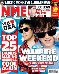
            I am going to analyse one more cover of a magazine to ensure I am keeping to the conventions of magazines and the genre which I will be producing. NME seems to be an appropriate model for the genre of magazine I would like to produce.
             In terms of denotation the font is in a masculine typography and again it reads NME, NME is the abbreviation of New Musical Express which appeals to the target audience of males between the ages of 17 to 30 years. The blue typography connotes relaxation, chilled and calm things that would relate to the artist on the front of the cover, this may appeal to her genre of music. The colour of the masthead which is blue would defy what Stanley Hall (1904)  said  'the common mood in teenagers was depressed' The main point of the front cover is to appeal to the target audience and so that they want to buy it and carry on reading. The masthead needs to stand out in order for it to advertise the brand of the magazine and in order for it to stand out from other magazines. The masthead is in the top 1/8 of the magazine which would be the first thing people see when they are looking at the magazines on the shelves. This is an essential convention of a magazine front cover.
             In terms of imagery the denotation of the image of Laura Marling is defying the stereotypes of woman icons as she is fully clothed and she isn't showing any skin, her hair is up and she overall looks relaxed and chilled out. This isn't something you would necessarily concern with woman models in the music industry. She appeals to men and that she is attractive and individual. Laura Marling is smoking in the image which would support Dick Hebdige (1988) "Youth as troublemaker" this would appeal to the target audience as it would be seen as an attractive trait to the audience. The colour of her clothing and the accessories relates to the colour palette of blue, white, black and grey. The image looks really good because she is breaking the usual stereotypes however she is intriguing and would appeal to the audience which is essentially what they are trying to do. In terms of iconography this image may be seen to appeal more to the secondary audience of women as she isn't showing skin or looking particularly seductive which is what they would normally expect so Laura Marling would be seen as a role model for women. However it doesn't mean that it can't appeal to men because it does just in a different way, and they focus more on the rebellious attributes than the sexy, seductive look.
           The lexis on the front of the magazine is a lot of extra information about whats included in the magazine. The main text is in the 'sweet spot' of the front cover which is the left third of the magazine. This is where the eye is drawn to when you first look at a magazine, this would be what is showing when the magazines are stacked on the shelves in shops. The teasers, headline, masthead and a quote from the interview inside is in that spot. The quote of the interview includes abstract nouns which are 'talent, integrity and self-loathing' the artist may be trying to tell the reader that its not as easy as its made out to be.  The text would support what Stanley Hall (1904) said 'All adolescences go through some form of emotional upheaval'.This would connect to the audience immediately because they would be urged to read in to the full article to see what its about. Above the quote is 'Laura Marling' the name of the feature artist this is in blue and is a lot larger than the rest on the text. Also the colour of the masthead is blue which connects the main headline and the masthead together. The rest of the text is in a small band/ list on the left third at the bottom of other artists that are included inside the magazine. The size of the text depends on how important the producer thinks it is.


Tuesday 5 February 2013

Music Magazine Genres

Music Magazine Introduction

Music magazine are used to promote; bands, gigs and festivals. Music magazine provide information to the reader regarding bands that relate with the genre of the magazine; interviews, concert, photo shoots and reviews on concerts, bands and albums. Each different music magazine has a different target audience depending on the genre of the magazine. However the main audience that the magazines tend to target is people aimed between 12 and 25, usually in the band of D to C as they are expensive and therefore disposable income would be necessary. There are particular genres of magazine including classical and folk apply to a neche market and a certain age group concerning older people. Music magazines tend to make bands more than break them, as they promote and advertise the band so I would say that they do more for helping them succeed than make them fail. Even when the magazine publishes negative stories it helps the band to gain more publicity and therefore gain interest in the band itself rather than the story. The music magazine industry is profitible because of the prices of the magazine, looking in stores you can see that the prices start at £2.35 and go all the way up to £5.00. The internet is a threat to the music magazine industry as the internet is full of blogs and website from the band themselves so if you want to find out any information you can access it instantly and it tends to be easier. Also waiting to find out information from a magazine may not be as convenient when you can automatically check online. These are some examples of music magazine genres; Indie, pop, rock, rap, classical, folk, house, R&B, reggae and DJ/club scene.
This is an example of an article regarding the decrease in music magazine sales because of the internet;


Music Magazine Genres

Just by observing the magazine shelves in shops you can see that the magazine industry have covered a range of music genres. Each different magazine genre uses slightly different media language to represent the intended target audience. I will explore the different genres of music and how they concerned with music magazines first before deciding what genre I will use for my final magazine. 

Rock

Rock music evolved from Rock and Roll and Pop music. It has developed to be a heavier version of pop music, rock music appeals to certain people and this is what I am going to discuss. 


This article discusses what the best rock songs are and gives you the oppurtunity to download the playlist. This is a specific blog allocated to the genre of rock.


This is a mission statement from the marketing side of Kerrang magazine expressing what the genre and target audience is for Kerrang.


These are links to some iconic rock songs;

AC/DC-Highway to Hell
http://www.youtube.com/watch?v=PzVxcolvAlM

Smells like Teen Spirit-Nirvana
http://www.youtube.com/watch?v=hTWKbfoikeg

Gloria-U2
http://www.youtube.com/watch?v=ybYgP48X2DY


These are some examples of the front covers of Kerrang! magazine;


 Kerrang is a weekly magazine and features bands and artists that the target audience would be interested in. They often make the front covers look crazy and wild which would link to the rock genre.


Indie
Independent or 'indie' music is an alternative style of music and has recently become a lot more popular, the bands often range in style but all come under the same genre of indie which differs from mainstream music.

This website lists some of the best indie-rock songs and bands;

http://www.indierockcafe.com/artists-and-bands/


Here are some examples of indie music;

Lets Dance to Joy Division- The Wombats
http://www.youtube.com/watch?v=ayuooyWPEUc

Teenage Icon- The Vaccines
http://www.youtube.com/watch?v=bFUKrsDDChE

Gold on the Ceiling- The Black Keys
http://www.youtube.com/watch?v=6yCIDkFI7ew


NME is one the most popular and well known indie magazine, it promotes the latest indie-rock bands and festivals.


NME represents the alternative/indie bands and promotes them so they gain fans. They also promote gigs and festivals the featured bands will be playing.


This is a reader profile of the NME magazine on the IPC website;

http://www.ipcadvertising.com/resource/6dcz2moj66wp0swdpyx5rv3o.pdf


Pop

Pop music has more harmony, rhythm and emphasis on the artists voice. There is usually some form of tuning involved with pop music. Pop music appeals to younger teenagers and is often said to be 'cheesy'. 

This is a list of the current Top 40 showing the best selling pop songs at the moment;

http://www.bbc.co.uk/radio1/chart/singles


Here are some examples of the popular pop songs at the moment;

Boyfriend-Justin Bieber
http://www.youtube.com/watch?v=4GuqB1BQVr4

Kiss You-One Direction
http://www.youtube.com/watch?v=T4cdfRohhcg

Diamonds-Rihanna
http://www.youtube.com/watch?v=lWA2pjMjpBs

Top of the Pops is the most popular of pop music magazine appealing to mainly girls between the age of 11 and 15.
This is a reader profile of the magazine;
http://www.immediatemedia.co.uk/advertising/Magazines/Top_of_the_Pops.html


Here are some examples of the front covers of Top of the Pops magazine which gives young teenage girls all the latest gossip on the boy bands and pop music weekly.


Classical
Classical music is often known as old fashioned and doesn't contain lyrics usually just classical instruments. Appealing to older people usually over 45 years of age. 

This is an archive of the best classical musicians of all time;


This is a radio station devoted to Classical music;
http://www.classicfm.com/


This is a profile of who listens to Classic Fm and therefore 
read the magazine; http://www.thisisglobal.com/interactive-sales/global-brands/classic-fm/


This is an example of the Classic FM magazine;


Friday 1 February 2013

Evaluation

Evaluation


             Bentley once stated "The making of the new through the rearranging of the old"(Bentley, 1997) this applies to my media magazine production as I had to look at the common conventions of a magazine before creating my own front cover and contents page. By doing this it meant that I had a better understanding of what looked right and what didn't look right. I started my research in to the common conventions with looking at the Bodmin College magazine. By analysing the college magazine I found out that it didn't actually fulfil its purpose as it didn't appeal to its target audience because overall it just looked messy, thrown together and just unprofessional. I decided to break the conventions when making my own my target audience stated that they wanted a more creative interesting take on the college magazine. As it has to appeal to the target audience of the college magazine which is students between the ages of 11 and 19 and the secondary audience of the parents/guardians of the students. My target audience preferred the style of NME but Cosmopolitan and Q followed closely behind. I decided to incorporate slightly the style of NME in to my front cover like there being one main image and this being the focus area. I did slightly incorporate the edgy font in to my heading and also the masthead includes the logo which the target audience would recognise. I used only one image on the front so it wouldn't look busy and would appeal to the target audience. The common conventions of the magazine link to my target audience as it will attract them and then get them to continue reading.
                My product represents the social group of students between the ages of 11 and 19 as these are the age range that attend the college, I want it to appeal to the target audience so they take an interest in the college magazine and actually want to continue reading. I think that my target audience would be the top end of the age range scale as they would probably be more interested in the stories and what the college has to offer as the younger students probably wouldn't read the college magazine as much as the 16-19 year olds. The students therefore that I am representing in the magazine are in higher education this makes it slightly easier to appeal to them. Stanley Hall said in 1904 "Adolescence is inherently a time of storm and stress when all young people go through some degree of emotional and behavioral upheaval before establishing a more stable equilibrium" he also said that the "Common mood of teenagers is depressed" My magazine defies these perceptions of teenagers as I have a model that is smiling as my main image also the fact that my target audience is at the higher end of the age range means that the students have stayed on to higher education in order to achieve. The fact that the target audience is students between 11 and 19 but the most popular ages of the readers is 16-19 means they haven't been involved in any form of criminal activity as they are carrying on their studies and they are furthering their education. I want my magazine to show off the fact that students and teenagers can be shown in a more positive light and I want to express the achievements of the students in the stories that are included in the content.
                  The target audience for my product is primarily the students of Bodmin College as the content involves the college and will apply to them. The age range of the Bodmin College students is 11-19 ranging from compulsory education to higher 6th form education. The secondary target audience is the parents or guardians of the students as the content of the magazine will concern their sons/daughters school and what is going on in the establishment. The magazine provides information on how the school is doing and the available opportunities for their children. The content needs to appeal to both audiences (students and parents/guardians) Through this information I ensured that my front cover appeals to the audience and that it is aesthetically pleasing, I made sure I avoided contrasting colours and kept to a colour palette of 3/4 colours on the front cover. I think my front cover fulfilled it's purpose as it contained the main conventions of a magazine. I think the headline of 'Student gets into Cambridge' would appeal to both audiences as parents would think highly of the education standards and therefore think highly of the college and students would hope to follow in the footsteps of the student.
           "The view that the internet and new digital media as an optional extra is replaced with recognition that they have fundamentally changed the ways we engage with all media" (David Gauntlett 2007) This quote represents the process I have gone through making the front cover and contents page as the way we use new media technologies has changed the process of magazine construction. The process has built my confidence up with using Photoshop as I know how to use the different tools in an effective manor including; magic wand tool, crop and how to work with different layers. From making it I can say that it supports Gauntletts theory and we engage with new media and the use of 'Blogger' as a way of submitting work and it shows engagement with each of the different aspects of the preliminary task. The use of 'Blogger' is a way of updating pieces of work easily also making it easier to change bits where needed.
             I think overall that my cover and contents page are an improvement on the original Bodmin College magazine as mine improves in appealing to the target audience specifically. My cover is not as busy and actually contains normal conventions of a magazine including a; masthead, main image (medium close-up) and headline. I still think there could be major improvements could be made to my front cover as it is still not as appealing as it could be. There could be more on the front cover that would appeal to the audience, however I do think I have included main features that have a big impact on what people think about the magazine. 
            Typography- The typography of both pages link together as the same font it used for the text on the front cover and contents page. The way the typography is arranged on the contents page make it look less messy and more organized and clear to read when looking at it. I haven't used different colours as I want it to be clear and simple, however this might have made it look more aesthetically pleasing. The black/white typography would appeal to the parents/guardians but not to the younger audience which is an improvement I could have made. However it draws more attention to the images which is what was intended.
            Images- The use of images is very effective as they need to link up to the stories that are included in the content of the magazine. I didn't want the images to make the contents page look busy or messy at all so I had to consider the layout of them and where I was going to place them on the page. This again needed to appeal to the target audience and the audience of students and they would like to see the images of to match the text. The audience are more likely to continue reading if they see images that appeal to them.
         Conclusion- Overall I think that there could have been a lot of improvements in the presentation of the front cover as it could include more imagery and text that would appeal to the target audience, however I didn't want it to become busy and overloaded with information. I like the colour palette I have used as it all links together and it makes it more aesthetically pleasing and this is a big improvement on the college magazine. I think the overall contents page is a boring with the white background and the lack of depth with the imagery. This could have been a major improvement I needed to address and in order for the audience to carry on reading.